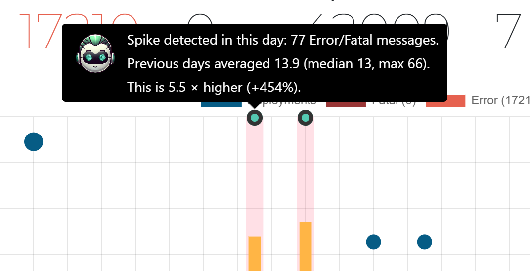
Spike explanations added to the Log Overview chart
The Log Overview chart has long highlighted anomalies with a red background, making spikes easy to spot. With this update, you can now hover the anomaly icon displayed above each red area to see a detailed explanation of why that specific section is classified as an anomaly. This helps you understand the underlying error patterns and quickly assess what caused the spike: