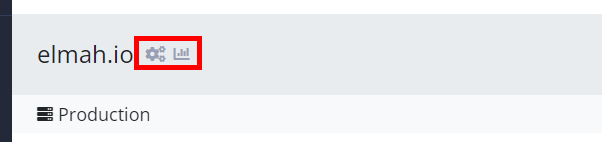
Changed and re-ordered icons
We usually don’t publish minor changes on this changelog, but I want to put a few words on a recent improvement to avoid any confusion. We’ve changed the icon for the organization overview from the eye to a chart to better illustrate what feature will trigger when clicking the icon. While doing so, we also switched the two icons around in the menu and on the dashboard to match what is there for log settings and search. So, in the future, when you need to access organization settings, click the first icon (gears). And when you need to access the organization overview, click the second icon (chart).